THUMBS UP ON THUMBS UP- EMBRACING (OR NOT) OUR AFFINITIES
The black sand of Iceland, one of my favorite places on Earth

The black sand of Iceland, one of my favorite places on Earth

Years ago, while walking through MOMA with Brian, a dear friend, my heart skipped a beat. As we approached one of the galleries, there before my very eyes was it. Bird in Space.

Observing my rapturous delight at seeing the work of Constantin Brancusi in person, Brian asked me a simple question. It turned out that this would be one of the most profound and pivotal points in my life as a design and visual creative.

“Sheena, why do you like this sculpture?”

My typical fallback cerebral response to this question was nowhere to be found. In a panic, I started to come up with a litany of ‘excuses’- um, the lines are nice, it is simplistic, the form is…

With a small laugh, Brian stopped me. “You don’t have to explain it to me,” he said. “And you certainly shouldn’t come up with reasons only because they sound good to someone else. You like what you like. And that is it.”

It was then, that I stopped my burgeoning need to show erudition. Right there in NYC at a gallery in a museum, it ended. By humbly addressing one of my flaws, with the help of that dear friend, I began to understand how to embrace, and ultimately explain, when necessary, the why of things that inspire, delight, and move me.

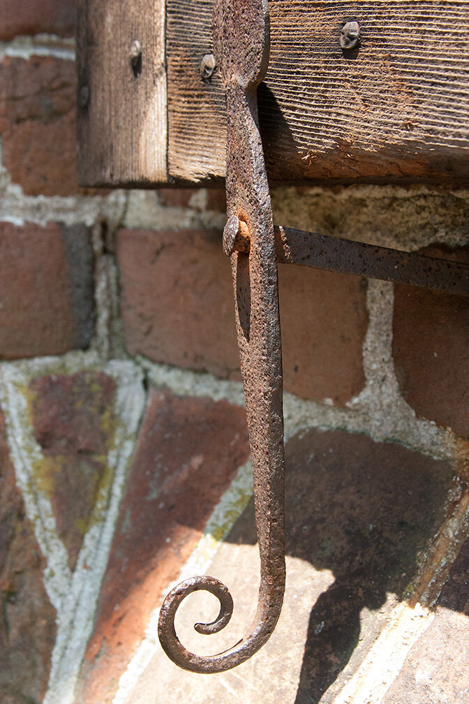
Lines are my steady fallback for starting a project- whether it is a work of art, a photograph, or an architectural project.

My music tastes range from the jangly. dreamlike atmospheric quality of shoegaze, to the ‘oontz-oontz’ of EDM. From the sweeping harmonic complexities of bossa nova- traditional and modern- to the fun upbeat pleasure that disco and nu-disco brings.

The reverie that I experience when looking at a particular type of photography sends my mind soaring. (I can say without reservation or excuse that I prefer black & white, grainy film images over any other image).

The frigidly beautiful black sand beaches and majestic mountains & fjords that frame the linear architecture and landscape of Scandinavia fascinate me endlessly.

My certitude in embracing this recognition of the aforementioned did not truly become cemented as a part of my life until I was at the Dayton Art institute looking at a Wassily Kandisky exhibition after the MOMA revelation. While standing waiting to look at one of the paintings, I noticed a father holding a baby. Upon being shown the painting, the baby began to giggle and reach out toward the statically animated squiggly lines and beautiful colors. That baby could not explain the why of his joy. He just embraced it happily, fully, and unabashedly. Just as I do, after 20 plus years.

sheena felece spearman
Sheer beauty through instructive corrosion
beauty-of-rust.jpg

Corrosion. Concrete. Combustion. And the indelible lessons of rust.

Carl is a very tall, scruffy-looking and kind dude that I have had the pleasure of knowing for about 10 years. We talk about a range of topics from neurology to the prettiness of asbestos, and our mutual love of vintage construction drawings.

Then there is Sam, a young man whose father reminded me that there are subtle differences in the textures and tones of Pennsylvania Bluestone, and to be aware of them

Finally, there is Patrick- a wiry Irishman who is a walking font of knowledge and can fit into places that my claustrophobic rear will not go.

Carl is my plumber. When I spoke to him last- he was at my home to replace some exterior hose bibs- he gave me a gentle reminder about galvanic action. It was the reason he had to replace my spigots. But in doing so, he also reminded me that there is a lovely textural quality to corrosion.

Sam is my mason. Without his design advice, certain spaces on the exterior of my house would not be as appealing. Besides having a seriously broad knowledge stone, he understands that craftsmanship in masonry is an art.

Patrick is my chimney sweep, who keeps me smiling with his witticisms, his distinct yet delicate dulcet Irish lilt, but mostly with his enthusiasm for the gaseous chemical and salient reactions of ‘internal’ residential combustion and a controlled raging fire.

It long been a belief of mine that learning a trade is extremely valuable. Apprenticing under people that care not only about the technical, but the aesthetic inherent in the craft of the trades, is extremely valuable with these three men.

And I would be remiss if I did not mention how fortunate I am to have Carl, Sam, and Patrick as my teachers.

sheena felece spearman
Inquisition of Inanimate Objects

Inspired by Louis Kahn’s query of brick, I use inquisition for this post with definite purpose and singular intent.


Must architecture always start with a line? No, not at all. For me, however, it usually does. This decision is not at the expense of other design commencement methods. Quite the opposite, as line, and its intense examination and rigorous inquiry, begets (necessary) paths of exploration.


By the tactile interrogation of the aforementioned line, I find that I discover the salient mysteries which are the result from the friction of charcoal or graphite as it is drawn on or dragged across a sheet of paper has left an indelible effect on the way I view the beginning of an architecture or design project.


Does line want to be a part of a section? Or, is it more appropriate for line to be a part of a floor plan as the thickness of a wall or the edge of a floor or as the separation of crafted space?

Repeating the process by sedulously drawing line over and again allows answers to become clearer, even though this inanimate object cannot ‘speak’ with a traditional audible voice.


This process is not arbitrary, though it might be argued that it is. But I do not think it is. Once ‘pencils down’ for the process has occurred, and it is time to make line an anonymous digital element (CAD or BIM), the inquiry changes trajectory. It is then that the wonder of nuance and subtlety begin to emerge.

inanimate-objects.jpg
sheena felece spearman
Tone, Not Bulk

During my personal training session last Friday, Ron- my trainer- assured me that our focus was on strengthening and toning my muscles. He told me that I was not to worry about building bulk because my stretches and exercises are targeted for building lean muscle mass, not big muscles.

Our conversation would not leave my head. I remembered a photo of Tryvanstårnet that I took while visiting Norway in 2005. Though my workout situation necessarily excludes the result of one (bulk) for the other (tone), this image causes me to contemplate the question of whether a building can be a product of both. From the perspective of an architectural massing language, that is.

As a material, I typically think of concrete as ‘bulk’. Hefty, weighty, and chunky are adjectives I use to describe its essence as an element of an architectural form. Viewing the tower from below, as I did when I captured this image, gives me pause to observe that tone and bulk are equally present. Since the majority of the project is concrete, the use of volumetric toning (base and spire), while keeping the design’s bulkiness (midsection) evident, is intriguing and thought-provoking.

*There are many photos online that depict the entirety of Tryvannstårnet, if your curiosity is piqued.

tryvannstarnet.jpg